A global bank’s brand bible, still in use years later.
CIBC’s online investing platform needed to modernize, become more relevant to customers, and meet WCAG 2.0 accessibility standards. As brand lead for the Investor’s Edge digital transformation, I built the visual identity system and led the design team that carried it across the platform.

The business friction
Investor’s Edge had to modernize and earn its place with self-directed investors, while meeting WCAG 2.0 accessibility standards across navigation, forms, applications, and trading flows.
It had to happen inside a large, regulated organization, during CIBC’s global rebrand, with many teams touching the brand and every decision needing alignment.
Strategic intervention and leadership
As brand lead for the Investor’s Edge digital transformation, I worked with CIBC’s core digital team to build a global visual identity: site components, new colours and their applications, icons, a type system, illustration, and photography.
I grew from designer into the team’s design authority within a year, leading and mentoring a multidisciplinary team across concurrent products and keeping every decision anchored in one system.
- 01Global brand bible and enterprise digital asset library
- 02Grid system for iconography and illustration standards
- 03Components and UX patterns designed to WCAG AA
- 04Brand systems and product workstreams translated onto Adobe Experience Manager
- 05Design-system rollout and training for the broader design team
Execution and visual showcase
The craft, and the strategic intent behind each decision.
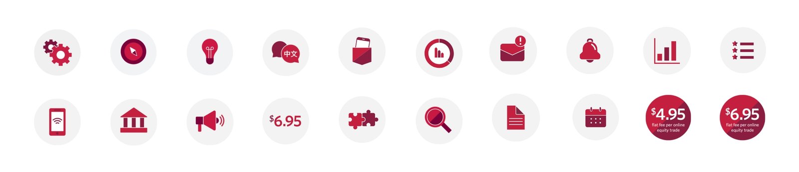
One icon language
A single iconography grid gives every product team the same visual vocabulary, so the brand stays consistent no matter who is designing.
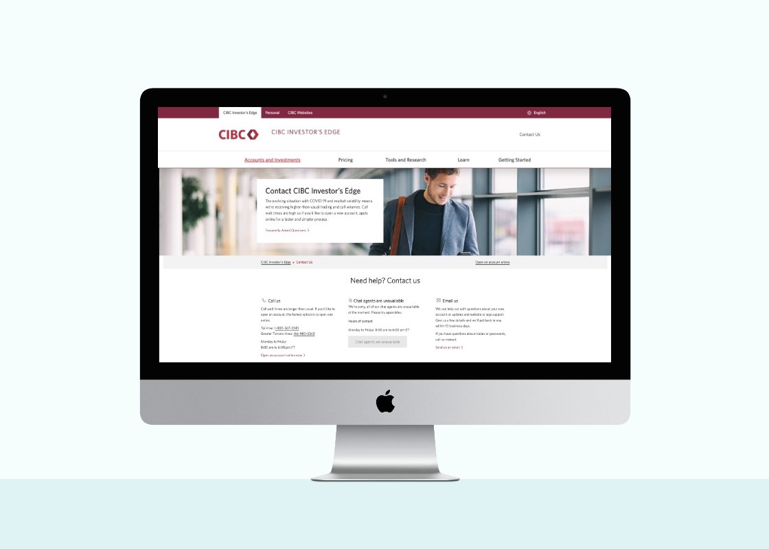
Modern, relevant, and accessible
Clear hierarchy, generous contrast, and familiar patterns make a complex investing platform feel approachable, and meet accessibility standards by design.

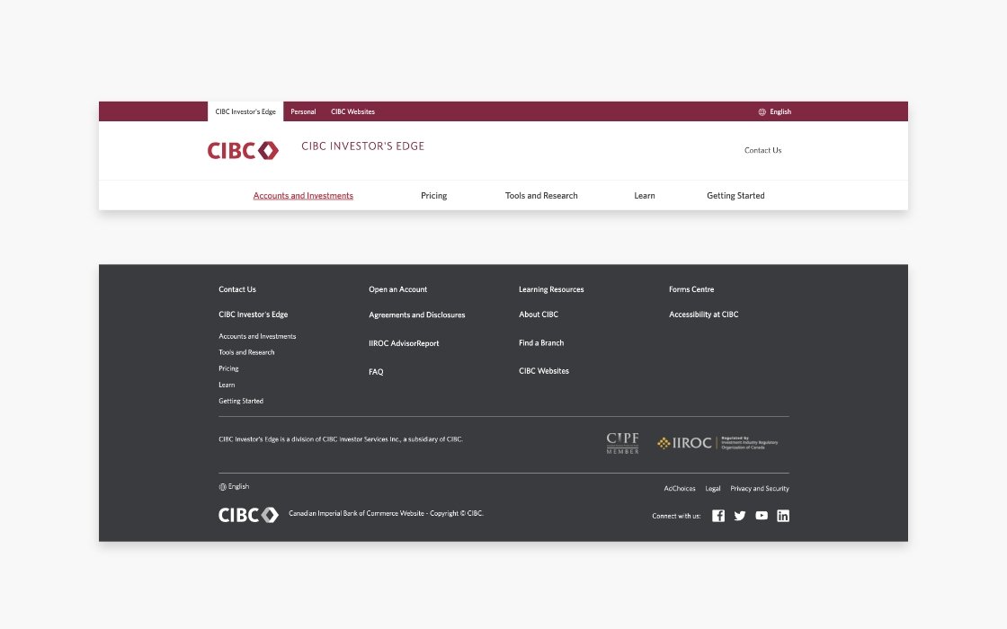
Components that scale
Global header, footer, and content modules were built once and reused everywhere, so new pages ship faster and stay on brand.

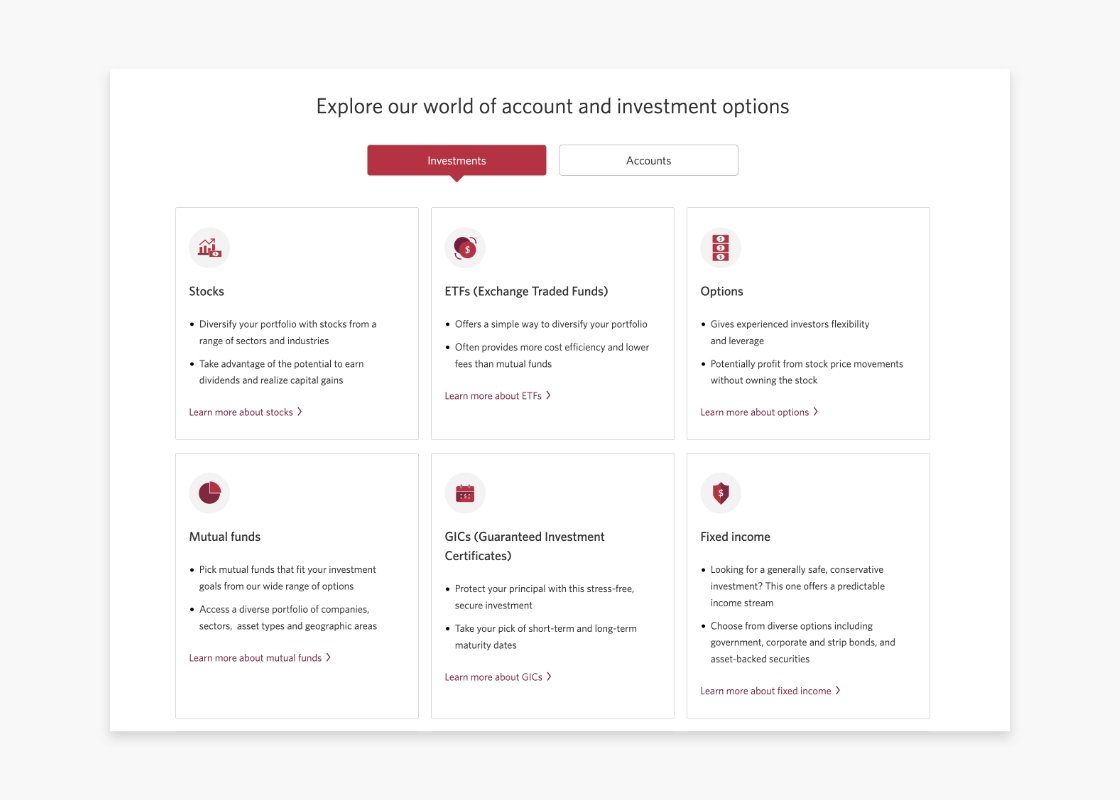
Clarity for self-directed investors
Comparison and offer modules turn product detail into decisions an investor can make in seconds.

Photography with purpose
Photography direction shows real people investing on their own terms, making the platform feel personal rather than institutional.


Designed around real investors
Personas kept design decisions anchored in how different investors actually use the platform, from first-timers to active traders.


Impact and outcomes
unified global brand bible and digital asset library, engineered to anchor CIBC’s entire enterprise digital ecosystem.
Components and UX patterns designed to accessibility standards across navigation, forms, applications, and trading flows.
Bridged design, development, and stakeholder alignment to migrate and translate complex brand systems and concurrent product workstreams onto Adobe Experience Manager at enterprise scale.

Have a brief like this one?
Whether you’re a brand or an agency, I’d love to hear what you’re working on.