A relaunch that felt like real life with a toddler.
Pampers Easy Ups training underwear relaunched with one of the biggest innovations in training pants in years, designed to look and feel like real underwear. The launch event brought that promise into a space parents and kids could actually enjoy.

The business friction
Training underwear is a milestone for families, and a product innovation only matters if parents believe it. Pampers needed the relaunch to feel warm, practical, and real, not like another product demo.
Every piece, from the window decals to the take-home calendar, had to carry the same message.
Strategic intervention and leadership
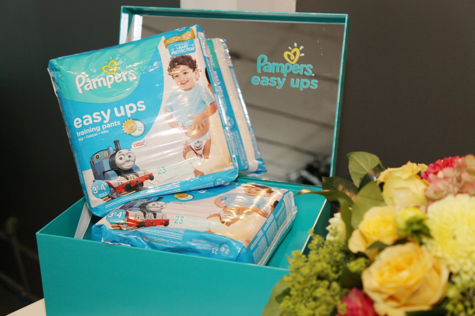
I designed the full suite of event executions so the room told one story: directional signage, a sandwich board, window decals, product and training-tips banners, framed prints for a child’s room, photo printout borders, a custom Pampers calendar for guests with stickers, ambassador t-shirts, food and refreshment signage, and event invitations.
- 01Event signage, banners, and window decals
- 02Framed prints and a styled children’s room
- 03Custom take-home calendar with stickers
- 04Ambassador t-shirts and event invitations
Execution and visual showcase
The craft, and the strategic intent behind each decision.
A room parents recognize
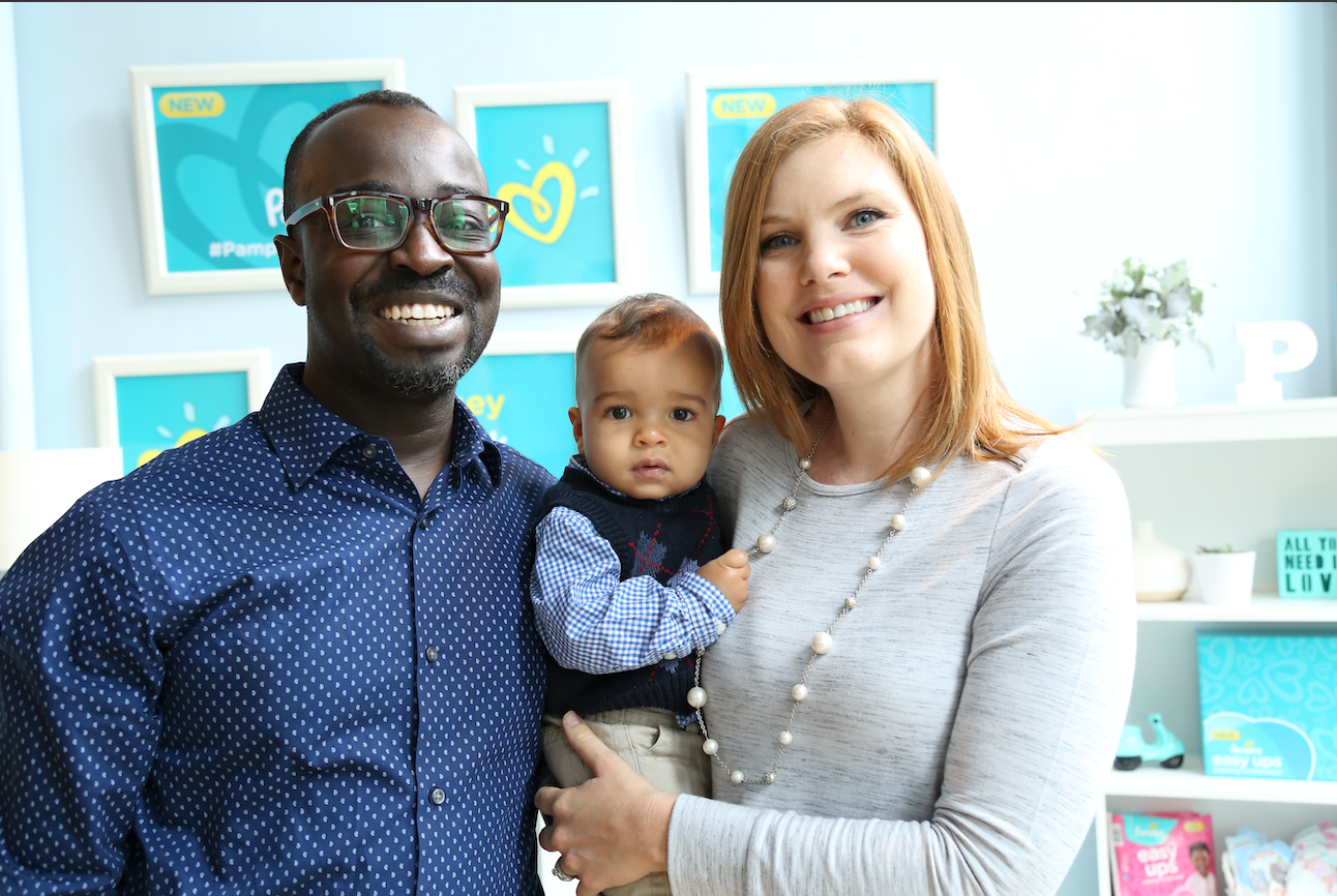
The event space was styled like a real child’s room, so the product sat in the life it was made for.




One message, every surface
Banners, prints, and signage share one look, so every piece reinforces the same promise.


Something to take home
A custom calendar, stickers, and photo printouts kept the brand in the home long after the event.




Impact and outcomes
event executions, from window decals to a take-home calendar, all designed as one system.
A custom calendar and stickers carried the brand into family homes.
Every surface told the same story about real-underwear comfort.

Have a brief like this one?
Whether you’re a brand or an agency, I’d love to hear what you’re working on.