A travel brand’s platform migration, turned into the brand refresh it needed.
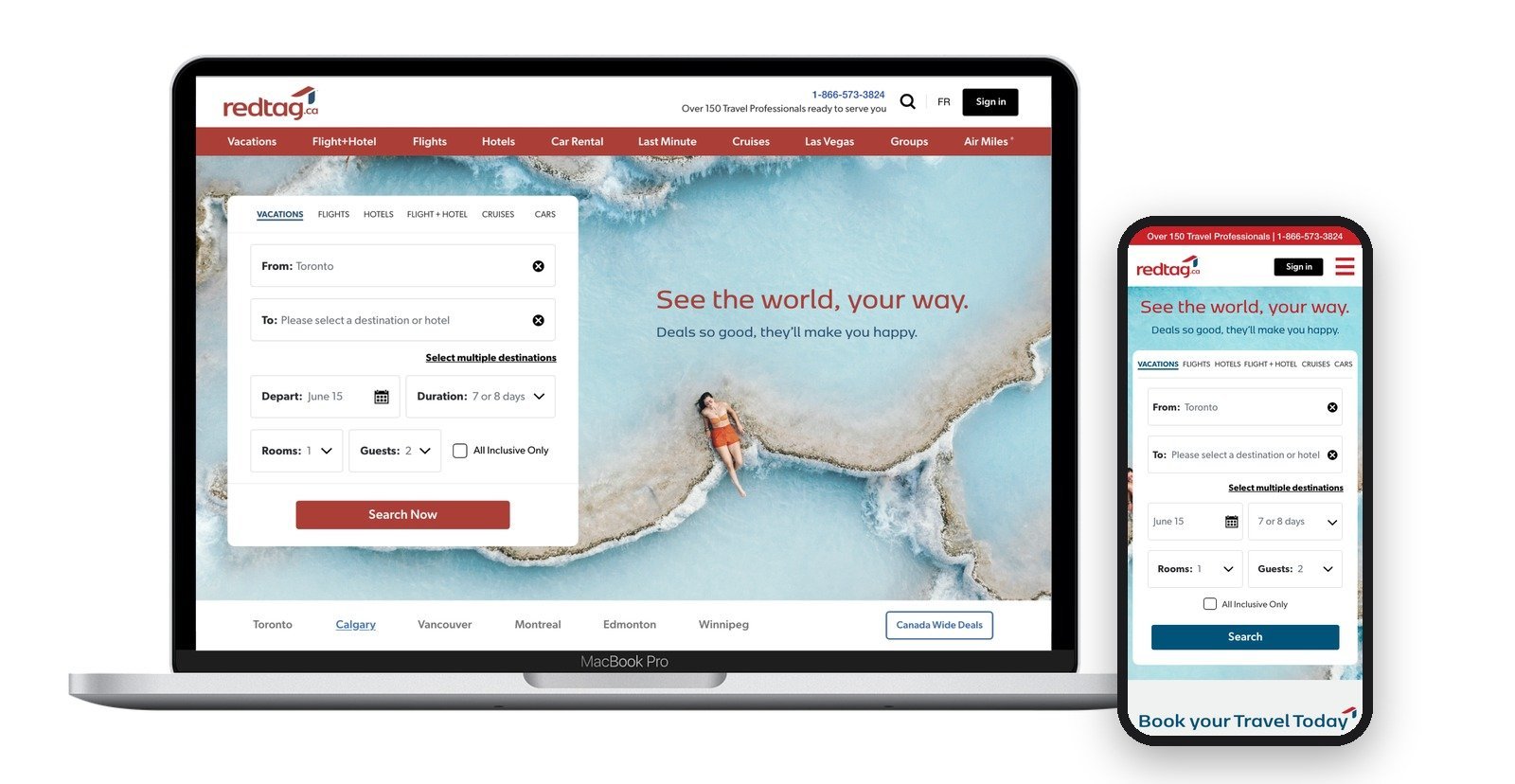
redtag.ca, a major Canadian online travel agency, came to us for a fast move to Adobe Experience Manager Cloud. As creative director, I turned that migration into a brand refresh, then built the global styles and reusable components that let both ship together.
The business friction
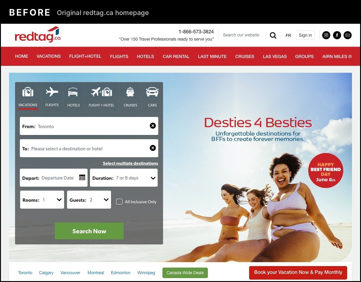
redtag.ca’s site had outgrown its code. Years of accumulated workarounds and legacy patches made routine updates slow, every change waited on the development team, and search didn’t work at all. On the surface, the site looked busy and dated, which made it harder for customers to feel confident booking.
The mandate was a fast migration to AEM Cloud. Moving the site across as it was would have carried the same clutter, and the same bottlenecks, onto a new platform.
Strategic intervention and leadership
A platform migration meant rebuilding every template anyway. I made the case to redtag.ca’s CEO and Chief Digital Officer that the same investment could modernize the brand as well: one build, one launch, and a site that looked as current as the platform underneath it. With their approval, I led design across both.
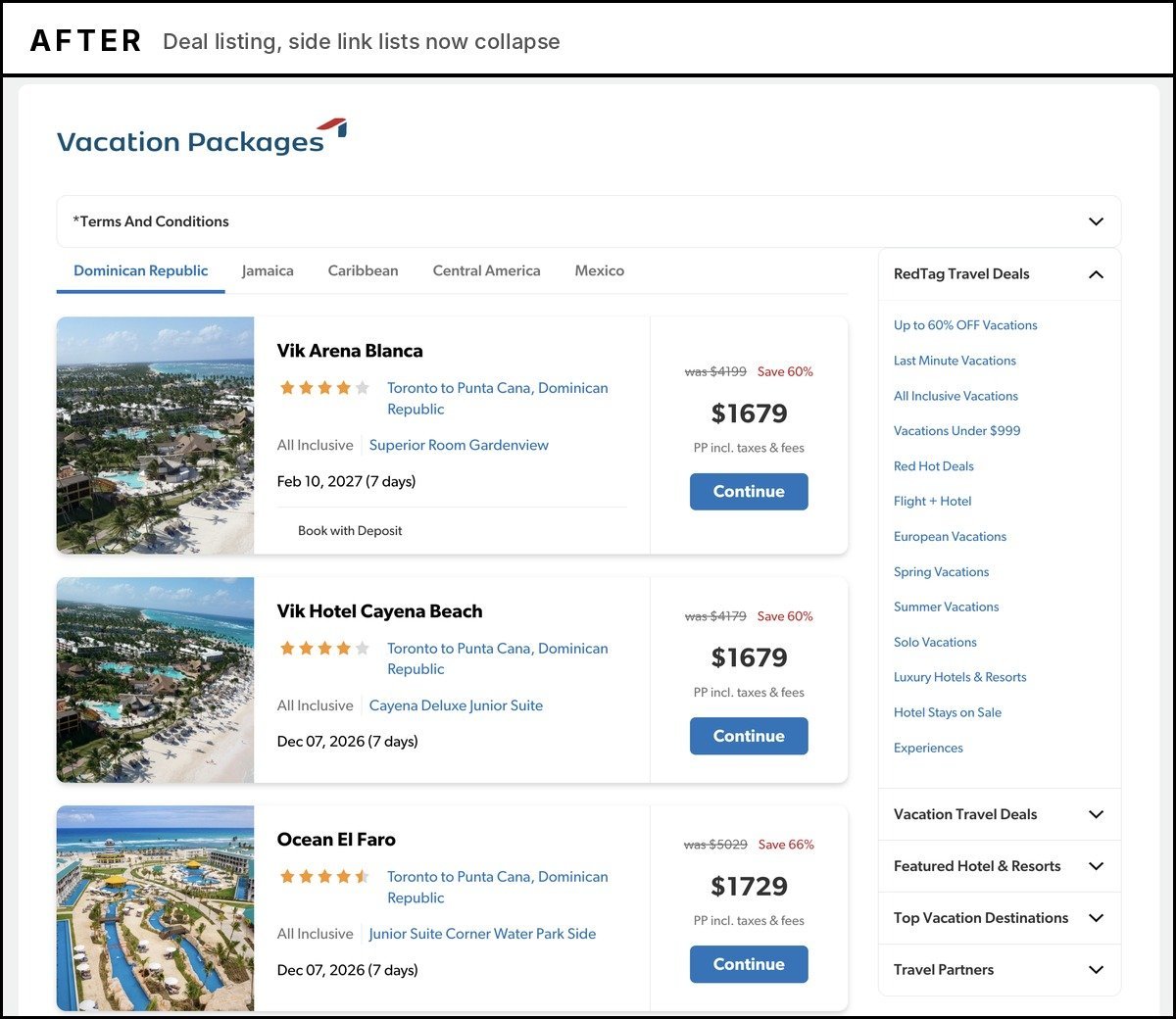
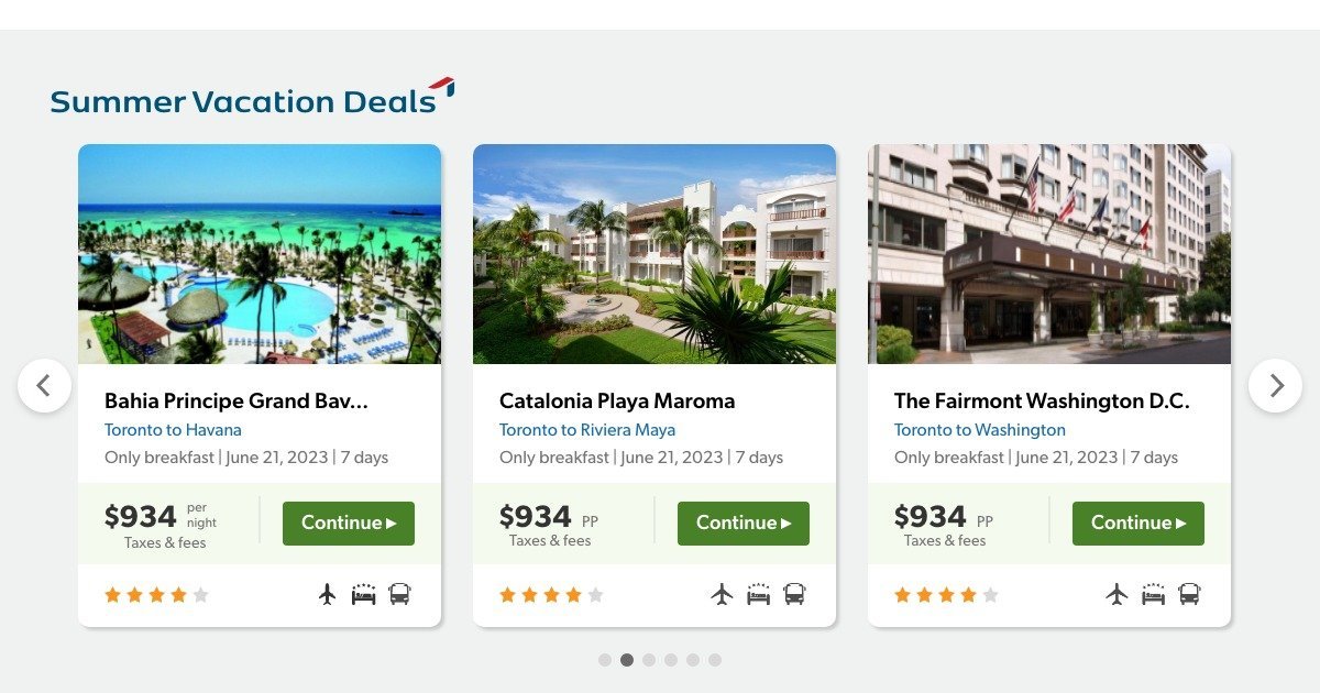
This was an evolution, not a rebrand. We kept the parts of redtag.ca customers already recognized and modernized the hierarchy, components, and experience around them. Carousels, collapsible link lists, and cleaner structural patterns replaced long stacks of repeated deals and open link lists, cutting excessive page length.
- 01Global styles for type, colour, spacing, and buttons
- 02Reusable components and templates, built in a three-month refresh phase
- 03Mobile-first layouts, tested against redtag.ca’s existing breakpoints
- 04Accessibility to WCAG 2.0 AA, with every layout sized for French
- 05Post-launch fixes, authoring support, and knowledge transfer
Execution and visual showcase
The craft, and the strategic intent behind each decision.
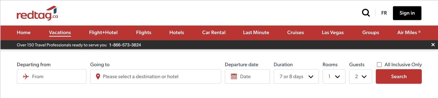
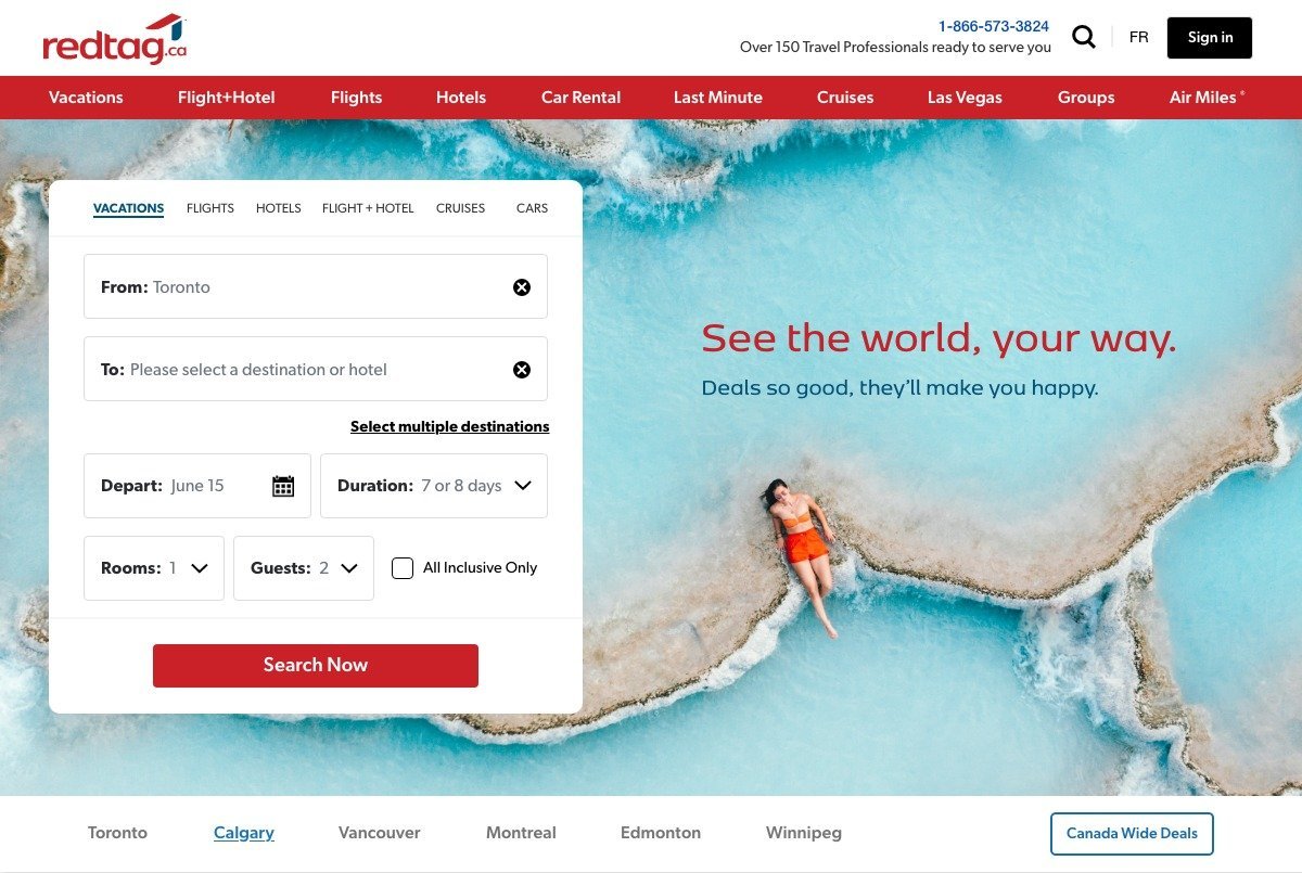
A cleaner first impression
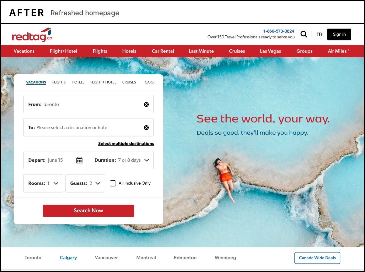
Same search, same red, far less noise. The refreshed homepage gives each section one job, so the first thing a traveller sees is where to start.
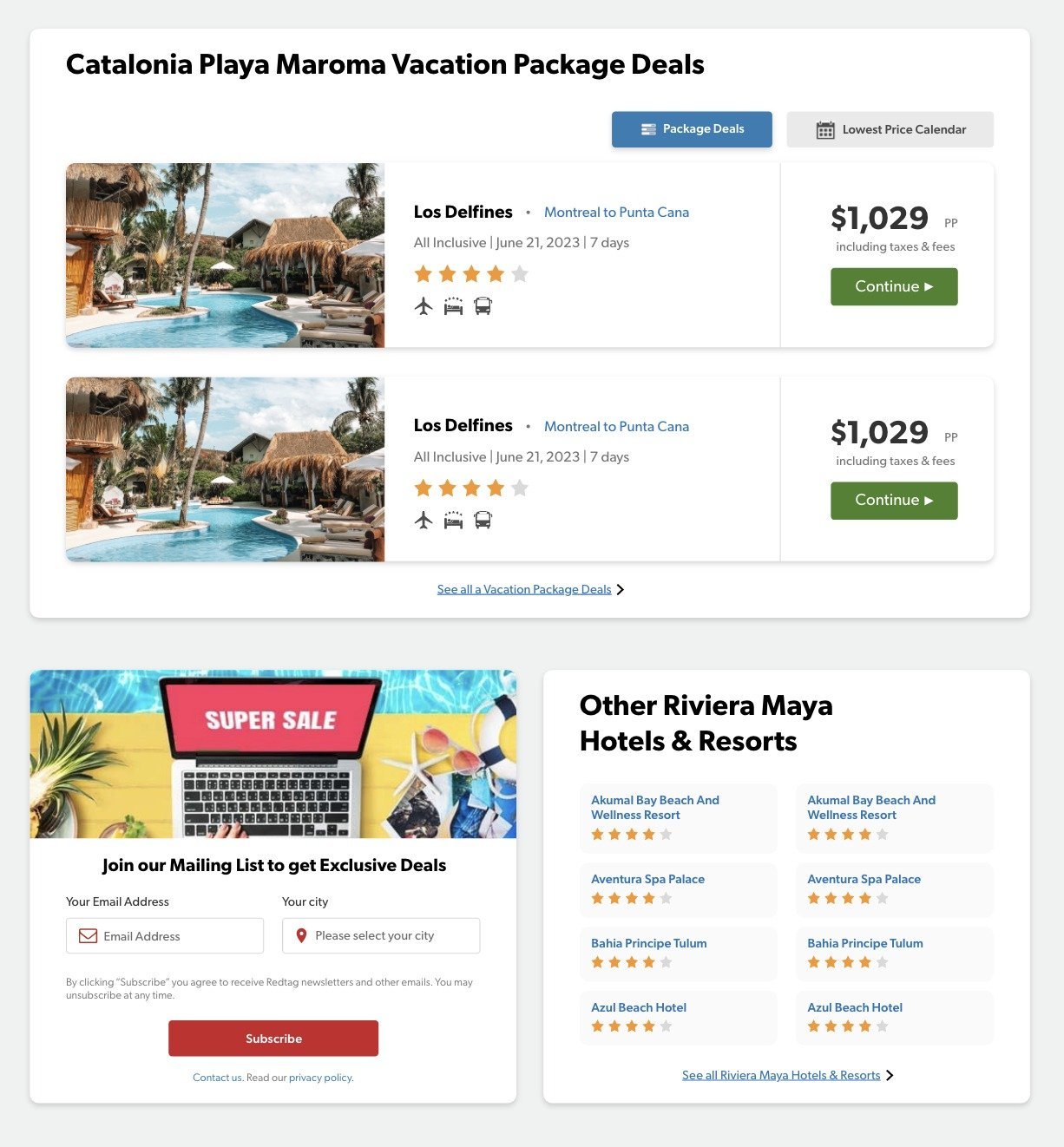
Deal cards, built for how travel sells
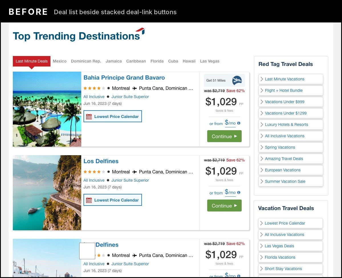
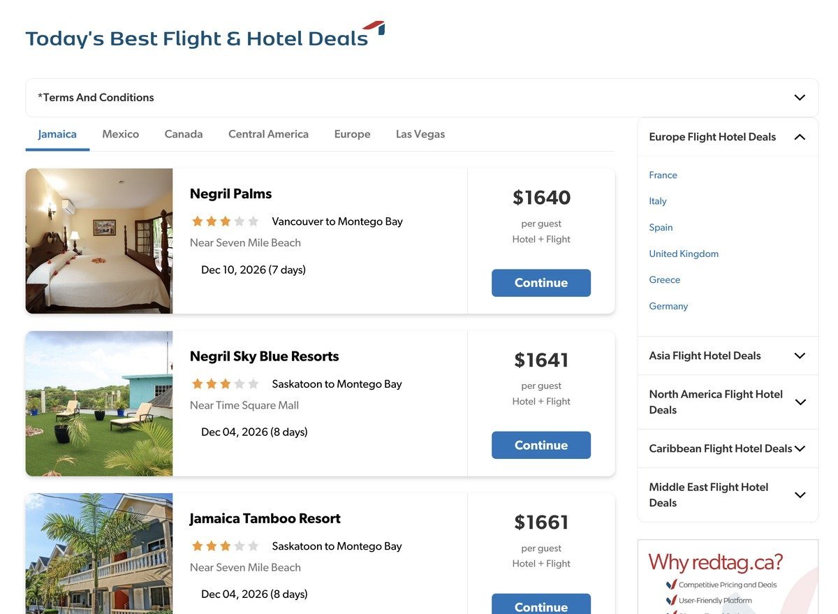
Travel retail has its own conventions, and redtag.ca relied on many of them: was-and-save pricing, deposit offers, room types, and long lists of deal links. Rather than strip them out, we designed around them. Deals now come in three card variations for packages, flight and hotel bundles, and featured offers, and the link lists that crowded the side of the original pages now collapse until they’re needed.
One type system, one palette
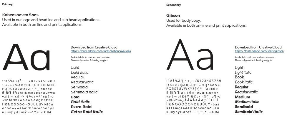
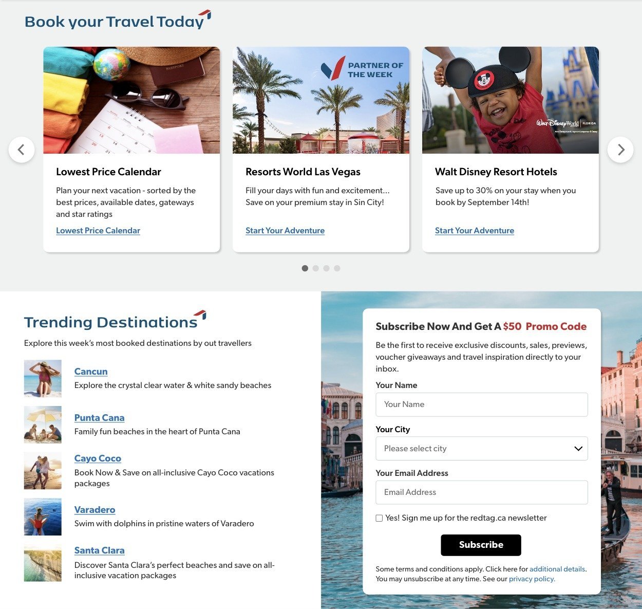
Kobenhavn Sans for headlines, Gibson for body copy, and a palette where every colour has a job, from primary actions to alerts. One set of global styles replaced years of layered CSS.

Components that ship pages
The global header and search, deal and package cards, trend lists, sign-up forms, and hotel listings are built once and reused across the homepage and hotel pages, so redtag.ca’s team can build and update pages in AEM without waiting on a developer.
Mobile first, for travellers on the move
Templates were designed for the phone first and tested against redtag.ca’s existing breakpoints, which the team wanted to keep, so every component and page holds its hierarchy from phone to desktop.
The refreshed homepage on mobile.
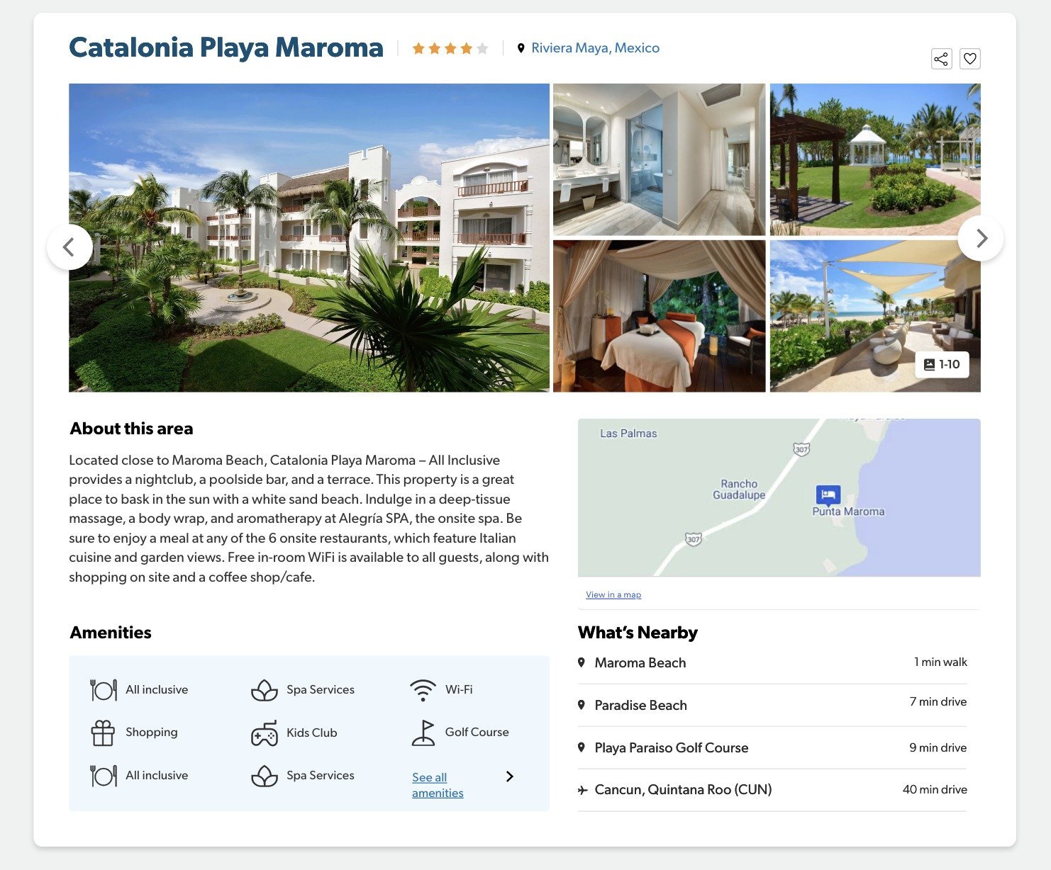
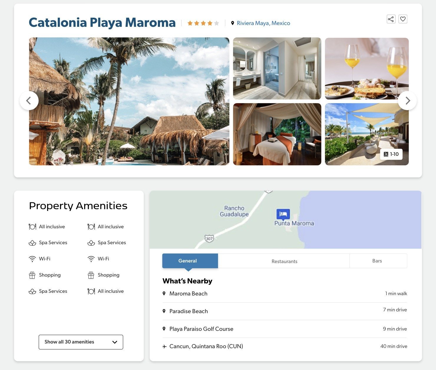
Hotel pages, built from the same parts
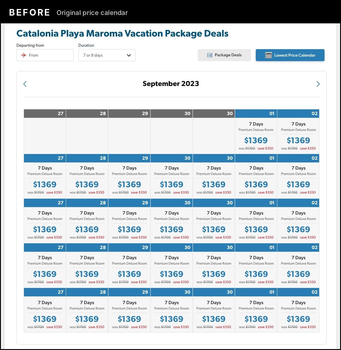
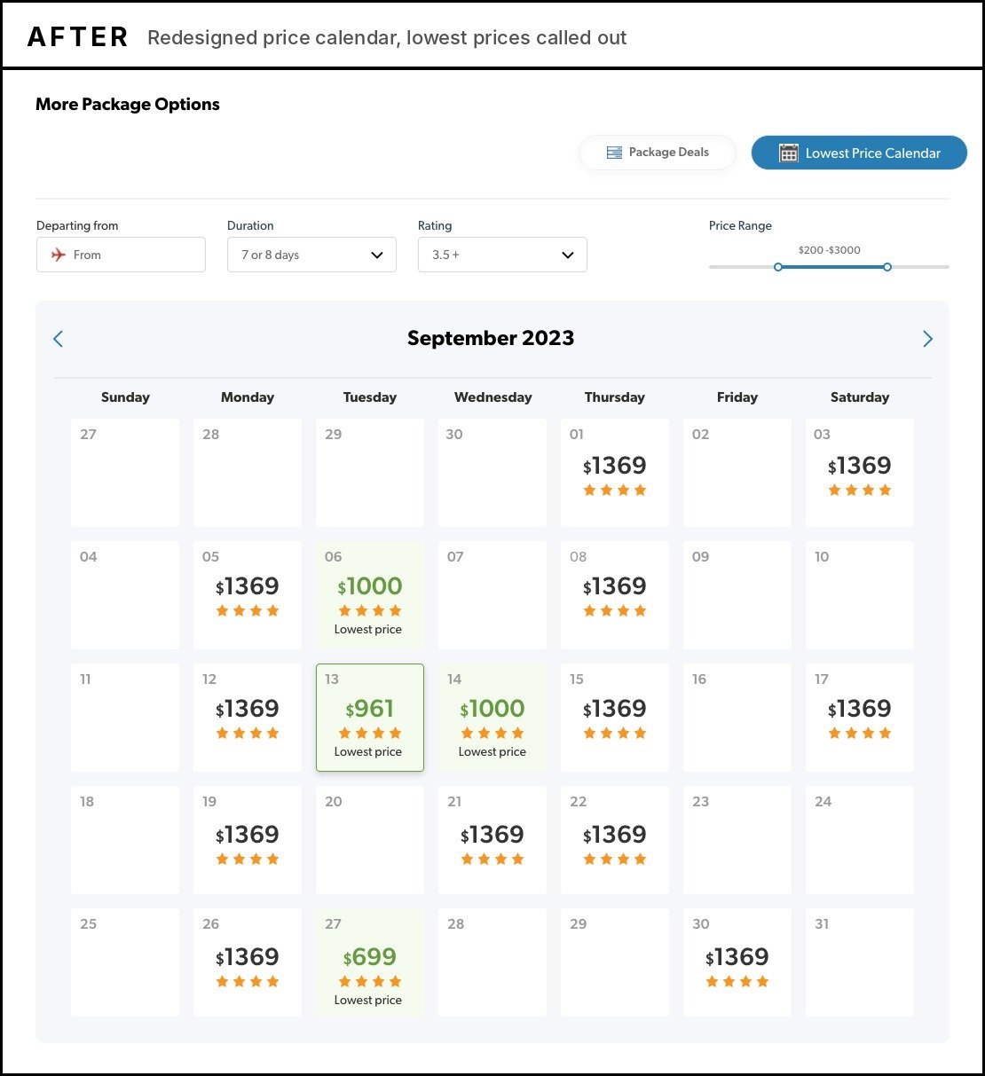
The same cards, tabs, and buttons carry through to every hotel page, each handing travellers off cleanly to the separate booking engine. The price calendar was rebuilt around the question travellers actually ask, which dates are cheapest, with the lowest prices called out. Behind the pages, new page structure, metadata, and tags got search working again and gave analytics a site it could read, while Dynamic Media’s Smart Crop fits each image to every screen.
Accessible and ready for French
Labelled fields, clear contrast, and one obvious action per form, designed to WCAG 2.0 AA and tested across pages, components, and test pages. Every layout allows 15% extra text length, so French copy fits without breaking a component.
Impact and outcomes
less CSS, with years of layered fixes replaced by one set of clean, reusable global styles.
fewer accessibility failures, tested with WCAG tools across pages, components, and test pages.
reusable components and templates, designed and delivered in a three-month refresh phase.
higher accessibility scores, measured with the same WCAG testing tools.
hotel pages migrated to AEM Cloud on the new templates.
pages structured and tagged so search and analytics work.

Have a brief like this one?
Whether you’re a brand or an agency, I’d love to hear what you’re working on.